Showing posts with label Preset. Show all posts

Friday, November 26, 2010

Lightroom Presets: 6 Black and White Presets

Today I am giving you five black and white presets, talk about a Black Friday Special... and you don't even have to deal crowds here. Four of the free presets I am giving away are color filtered presets and the fifth is a strong contrast black and white preset.


The image to the left is a strong black and white image on its own, but with a little boost of contrast or using a color filter the image can change either a little or drastically.

The image below is the same image with the Black and White Blue Filter. This is applied by amplifying the blue tones sliders in the B&W tab in the HSL tool.


Black & White Blue Preset
 Blue comes in many tones ranging from green-blue (aqua), blue and red-blue (purple). I accomplish this type of effect by increase the gray value of blue to 100%, and the gray values of aqua and purple to 50%. All other colors are set to zero. As a result, anything with a blue tone to it is brighter and more vibrant.

You may notice a light shift in the blue tones in the water. Click on any of the images to see a larger version of the image and see more detail in subtle changes.


Black & White Green Preset
 The Black and White Green Filter image is the same image but with a green filter applied to it. This is applied by amplifying the green tones sliders in the B&W tab of the HSL tool.


Green comes in many tones ranging from yellow to green-blue (aqua). I accomplish this type of effect by increase the gray value of green to 100%, and the gray values of aqua and yellow to 50%. All other colors are set to zero. As a result, anything with a green tone to it is brighter and more vibrant. Looking closely at the image, click on it to see the larger version, the belt of the young man is brighter than the original image above.


Black & White Red Preset
 The Black and White Red Filter image is the same image but with a red filter applied to it. This is applied by amplifying the red tones sliders in the B&W tab of the HSL tool.


Red comes in many tones ranging from Magenta to orange. I accomplish this type of effect by increase the gray value of red to 100%, and the gray values of magenta and orange to 50%. All other colors are set to zero. As a result, anything with a red tone to it (mainly in the skin in this image) is brighter and more vibrant. Looking closely at the image, click on it to see the larger version, the ribs of the young man and the arm of the young lady are brighter than the original image above.

Black and White Yellow Preset
The Black and White Yellow Filter image is the same image but with a yellow filter applied to it. This is applied by amplifying the yellow tones sliders in the B&W tab of the HSL tool.


Yellow comes in many tones ranging from orange (red-yellow) to green (green-yellow). I accomplish this type of effect by increase the gray value of yellow to 100%, and the gray values of orange and green to 50%. All other colors are set to zero. As a result, anything with a yellow tone to it (mainly in the skin highlights) is brighter and more vibrant. Looking closely at the image, click on it to see the larger version, the ribs of the young man and the arm of the young lady are brighter than the original image above and are highlighted differently than the Black & White Red preset results.


Black & White Original Image
 Finally, we have the strong contrast black and white preset.

Contrast in photography is the opposition of light and shadow. The more opposition there is between light and shadow the stronger the contrast.


In the original photo on the left, there is a natural high contrast to the image due to the position of the unfiltered sun in the sky. This contrast can be exploited to make a strong artistic statement with a few adjustments I made and saved as a preset.


Black & White Strong Contrast
 By amping the contrast, black levels and tweaking the tone curve into a strong S-Curve, the contrast of the image is made unnaturally strong creating a depth to the image that was lacking in the original. The patterns in the water are more pronounced and the highlights on the back of the boy are blown out completely.


Now while blown highlights are not a good thing according the rules; it is only a rule so it can be broken if it helps the image to work. In this case, I like the result and am sticking by it.

Download B&W Blue Here

Download B&W Green Here

Download B&W Red Here

Download B&W Yellow Here

Download B&W Strong Contrast Here

To install the preset, copy the file in the zip (xxx.lrtemplate) to your Develop Presets folder on your computer. If you don't know where to find this folder, open Lightroom. Click on Edit menu and select Preferences. Click on the Presets tab and click the Show Lightroom Presets Folder... button.

Saturday, November 20, 2010

Lightroom Preset: CMS-High Key

Wow I am running so behind on everything, even blogging.

Before High Key Preset
The purpose of high key in photography is to remove as much of the dark tone from the photograph as possible creating a noticeable lack of contrast.

High Key images have a bright and happy feel to them, especially compared to Low Key images which are dark and moody.  This bright happy feel tends to allow the view to experience positive emotions. Keep this in mind when selecting your high key subjects. High Key adds a nice effect of softening the image through tonal control and High Key works extremely well for removing any skin imperfections as well.

For this preset to work your image must be at least properly exposed. Under exposed images will generally experience noise and only appear to be slightly over exposed; rather than high key.


This preset is accomplished by bumping the exposure and brightness quite a bit, but also adding some fill light and tweaking the tone curve with the following settings:
In the after-image on the right, you can see the final results. A strong light feeling is applied to the portrait and there is a nice loss of detail to the skin which cleans the image up nicely. And although the subject's facial details are lost, this is sort of the point. High Key works really well with non-people subjects like a white rose on a white backgorund, or even chess pieces. Have fun with this.  


Download Here

To install the preset, copy the file in the zip (xxx.lrtemplate) to your Develop Presets folder on your computer. If you don't know where to find this folder, open Lightroom. Click on Edit menu and select Preferences. Click on the Presets tab and click the Show Lightroom Presets Folder... button.


Sorry for the delay in getting this out... but it is here now. Enjoy. Come back on Monday for another preset.


Highlights: -66

Lights: +43

Darks: +100

Shadows +9

After High Key Preset


Tuesday, November 9, 2010

Lightroom Preset: Two HDR Presets

The first of the two presets is the HDR Natural preset. The image on the right is an HDR image after being processed in Photomatix 3.2.


When I am processing in Photomatix I tend to not play much with the HDR’s saturation levels because I, being a control freak, have and therefore exercise more control over the saturation levels in Lightroom, specifically the saturation of specific color channels.

And although I have a lot of dynamic range in this photo, it lacks any substantial color punch, a direct result of processing the flat looking raw files directly in Photomatix.

An so, in the image on the left, I have played with the saturation levels of the photograph and the result are strikingly different than the original. The yellows pop, not only in the sky, but in the water and the clouds take on an otherwise non-existent (in the original) purple hue, which is there, but subtle.


This is accomplished by using the HSL tool and making the following adjustments, plus a few other adjustments; SaturationAdjustmentAqua = 0, SaturationAdjustmentBlue = 0, SaturationAdjustmentGreen = 0, SaturationAdjustmentMagenta = 19, SaturationAdjustmentOrange = 38, SaturationAdjustmentPurple = 90, SaturationAdjustmentRed = 0, SaturationAdjustmentYellow = 50.

The other method of HDR is to produce a surreal, painterly or grunge look to the photograph. In the photo on the left, I processed it in Photomatix with that look and feel in mind, but again didn’t mess with the saturation in Photomatix because I am a control freak.


As a result the output from Photomatix was halfway to where I wanted the photo to be. So I began the process of tweaking with the photo in Lightroom. There were a tone of changes made to this photo to the look that I was looking for.

I made the following adjustments: Brightness = 51, ColorNoiseReductionDetail = 50, FillLight = 11, HighlightRecovery = 100, LuminanceAdjustmentAqua = 0, LuminanceAdjustmentBlue = -29, LuminanceAdjustmentGreen = -38, LuminanceAdjustmentMagenta = 0, LuminanceAdjustmentOrange = -8, LuminanceAdjustmentPurple = 0, LuminanceAdjustmentRed = 0, LuminanceAdjustmentYellow = -20, LuminanceNoiseReductionContrast = 0, LuminanceNoiseReductionDetail = 50, SaturationAdjustmentAqua = 0, SaturationAdjustmentBlue = 0, SaturationAdjustmentGreen = 0, SaturationAdjustmentMagenta = 0, SaturationAdjustmentOrange = 54, SaturationAdjustmentPurple = 0, SaturationAdjustmentRed = 0, SaturationAdjustmentYellow = 75 and Vibrance = 31.


The image on the right shows the results, which is exactly what I was looking for. And now you too can get this look to your photos, just download one or both of the presets below.

Download HDR Natural Here


Download HDR Surreal Here

To install the preset, copy the file in the zip (xxx.lrtemplate) to your Develop Presets folder on your computer. If you don't know where to find this folder, open Lightroom. Click on Edit menu and select Preferences. Click on the Presets tab and click the Show Lightroom Presets Folder... button.

Saturday, October 30, 2010

Free Lightroom Preset: Waves Preset


Waves Before

This image is fairly flat and lacks that needed punch to make it something worth looking at. So while on vacation, at the coast of all places, I worked on a preset that generated the look that I was going for to make those waves pop. Take a look at the larger version (click on the image on the left) to see what I mean by this photo not having any pop.

Waves After Preset
The image above is the result after the preset is applied. I accomplished this look by making changes to the following setting in Lightroom; grain frequency 50, grain size 25, Recovery 66, Green Luminance 100, Noise Reduction Detail 50, Luminance Smoothing 18, Tone Curve settings (darks -12, Highlights Split 75, Lights 22, Shadows Split 25) and Vibrance 33. Because of the grain settings of this preset, it is specifically for Lightroom 3. 

Download Here

To install the preset, copy the file in the zip (xxx.lrtemplate) to your Develop Presets folder on your computer. If you don't know where to find this folder, open Lightroom. Click on Edit menu and select Preferences. Click on the Presets tab and click the Show Lightroom Presets Folder... button.

Tuesday, October 26, 2010

Lightroom Presets: 7 Selective Coloring Presets

Roy G Biv in the House!
Selective color is a fun process of making colors pop on an otherwise black and white image. I chose the image on the right to be my sample image because just about every color in the rainbow is on display here. Say hello to my oldest daughter a.k.a Monkey Jr.


Let me explain the purpose of selective color, as I understand it. Selective color is generally used to highlight something of significance in scene; think of the little girl in Schindler’s List with the red coat in a film that was shot in all black and white. The girl and her red coat was how it was seen through Schindler’s eyes. And when he saw the coat in the pile of burning bodies it was at this point that he realized he could no longer turn a blind eye to the evils being committed by the Nazi party and began his quest to save as many prisoners as he could. Selective color in that film was used very carefully to convey a powerful statement that made the viewing experience of the movie more personal for the viewer and created a personal attachment to the little girl that made her death more emotional.

Today, selective color is, for the most part, used all too freely. It does not make an impact to the photo. It is just used for the cool factor. But in the sea of selective color photos there are a few images that do selective color properly, but they are lost in that sea.


In presenting these seven presets, I suggest using this treatment where it will make an impact. Use it to add something other than the cool factor to your image. So without further lecturing I present the seven presets.

Selective Color: Aqua

Selective Color: Aqua


Aqua is made up of two primary colors; green and blue. So to get the aqua to pop I adjusted the hue of the green to the aqua hue, +100, and the adjusted the hue of the blue to aqua, -100. There is no bump in saturation for any of the three hues, but all hues outside of aqua are taken to a saturation of -100.

While this photo, on the right, will not win any awards for brilliance, it does show the effectiveness of this preset quite well.


Selective Color: Blue


Blue includes two colors outside of blue; purple and aqua. So to get the blue to pop I adjusted the hue of purple to the blue hue, -100, and adjusted the aqua hue to the blue hue. +100. There is no bump in saturation for any of the three hues, but all hues outside of blue are taken to saturation of -100.

In the case of the blue, some other tweak might need to be applied for this image. Notice the blue in her shirt and possibly her eyes? This would require a local adjustment brush, set to -100 saturation, to remove. A little more effort, yes, but the results would be stunning.

Selective Color: Green


Green includes two colors outside of the green hue; yellow and aqua. So to get the green to pop I adjusted the hue of aqua to the green hue, -100, and adjusted the yellow hue to the green hue. +100. There is no bump in saturation for any of the three hues, but all hues outside of green are taken to saturation of -100.

Some other tweak might need to be applied for an image. If the image had the girl wearing a green shirt or pants, this would require a local adjustment brush, set to -100 saturation, to remove. A little more effort, yes, but the results would be worth the effort.


Selective Color: Orange
 Selective Color: Orange


Orange includes two colors outside of the orange hue; yellow and red. So to get the orange to pop I adjusted the hue of yellow to the orange hue, -100, and adjusted the yellow hue to the red hue. +100. There is no bump in saturation for any of the three hues, but all hues outside of orange are taken to saturation of -100.

Some other tweaks need to be applied for this image. As you can see from this image, the girl’s face, hands and lips have an orange/reddish hue to them, basically any flesh tone. This would require a local adjustment brush, set to -100 saturation, to remove. It is a little more effort, yes, but the results would be worth it.

Selective Color: Purple


Purple includes two colors outside of the purple hue; blue and magenta. So to get the purple to pop I adjusted the hue of magenta to the purple hue, -100, and adjusted the blue hue to the purple hue. +100. There is no bump in saturation for any of the three hues, but all hues outside of purple are taken to saturation of -100.

Some other tweaks need to be applied for this image. As you can see from this image, the girl’s shirt has a purple hue to it. This would require a local adjustment brush, set to -100 saturation, to remove. It is a little more effort, yes, but the results would be worth it.

Selective Color: Red


Red includes two colors outside of the red hue; orange and magenta. So to get the red to pop I adjusted the hue of orange to the red hue, -100, and adjusted the magenta hue to the red hue. +100. There is no bump in saturation for any of the three hues, but all hues outside of red are taken to saturation of -100.

Some other tweaks need to be applied for this image. As you can see from this image, the girl’s face, hands and lips has a purple hue to it. This would require a local adjustment brush, set to -100 saturation, to remove. It is a little more effort, yes, but the results would be worth it.

Selective Color: Yellow

Yellow includes two colors outside of the yellow hue; orange and green. So to get the yellow to pop I adjusted the hue of green to the yellow hue, -100, and adjusted the orange hue to the yellow hue. +100. There is no bump in saturation for any of the three hues, but all hues outside of red are taken to saturation of -100.

Some other tweaks need to be applied for this image. As you can see from this image, the girl’s face, hands and hair has a purple hue to it. This would require a local adjustment brush, set to -100 saturation, to remove. It is a little more effort, yes, but the results would be worth it.

Download Aqua Here


Download Blue Here

Download Green Here

Download Orange Here

Download Purple Here

Download Red Here

Download Yellow Here

To install the preset, copy the file in the zip (xxx.lrtemplate) to your Develop Presets folder on your computer. If you don't know where to find this folder, open Lightroom. Click on Edit menu and select Preferences. Click on the Presets tab and click the Show Lightroom Presets Folder... button.

Monday, October 18, 2010

Lightroom Preset: CMS - BW Face

Before the B&W Face Preset
Yes this is a scary image of me. But that was the intent. Once day I did a series of shots based on movie characters. I posed for shots of the likes of Gandalf from the Lord of the Rings trilogy and Hannibal of Silence of the Lambs and this one, my favorite from the series, is my King Leonidas from the movie 300. Imagine the words "This is Sparta" being bellowed out.


See this image as a reference to what I was trying to accomplish:

So while the color image has its own power and impact, I was actually envisioning something a little more powerful... something a little more shocking. Something that would make people say OGM! 

So I began playing with a black and white version of the image in Lightroom and wouldn't you know it, I was able to create the image I envisioned.


In the image on the right, yes it is the same image, I developed a setting that I was able to use on all of the series images. I made the following adjustments once I converted the image to black and white:

Blacks is set to 25, Clarity set to 100, Contrast set to 91, Aqua gray value set to -12, Blue gray value set to 29, Green gray value set to -24, Magenta gray value set to 10, Orange gray value set to -11, Purple gray value set to 15, Red gray value set to -10, Yellow gray value set to -16, Recovery set to 33 and in the tone curve my settings were Highlights 0, Lights 23, darks -20 Shadows 0; which creates a slight S-Curve. A fun way to add some serious intensity to an already tense image.

Download Here

To install the preset, copy the file in the zip (xxx.lrtemplate) to your Develop Presets folder on your computer. If you don't know where to find this folder, open Lightroom. Click on Edit menu and select Preferences. Click on the Presets tab and click the Show Lightroom Presets Folder... button.

Monday, October 11, 2010

Free Lightroom Preset: CMS Eyes Enhance Local Presets

Today's Lightroom presets are for the local adjustment brush inside of Lightroom. One of the powerful features of Lightroom is the Local adjustment brush. This gives the photographer the power to make specific changes to certain parts of the photograph without affecting the entire image.
In the image on the left I have already made my adjustments to everything in the basic tools (exposure, brightness, etc) as well as adjusted the tone curve.

Making these global adjustments before making local adjustments is critical because adjusting these after making local adjustments will adjust the entire image, including the local adjustment areas. So when you have your local adjustments just right, any global adjustments you make after can create a huge mess of your local adjustments.


Eye Whitening
 The first preset is the CMS-Eyes – Whiten preset. This local adjustment brush preset is used to whiten and brighten the whites of the eyes. Two secrets to applying this adjustment is to turn on Auto Mask, set the feather slider to 35 and zoom in at least 1:1, 3:1 if you need to have a little more control.


Then paint with the brush in the white areas of the eyes. The whites of the eyes will soften a little and whiten and brighten up. If you look at the before photo (above) and the after photo (right) you can see a subtle difference. The important thing to remember is that the eyes need to be properly exposed to begin with for this brush preset to be most effective.


Dark Blue Eyes
 The CMS-Iris Enhance - DK Blue local adjustment brush preset is used to enhance blue eyes, to make the blue pop with a darker tint.


It can also be used to change the color of the subject’s eyes.

The photo on the right has the effect painted onto one eye and not the other to give a great representation of the effect.

Also applied here is the CMS-Eyes – Whiten preset, mentioned above to give you a glimpse of the combined impact of the two effects. Apply this brush to the iris of the eye only.


Dark Green Eyes
 The CMS-Iris Enhance - DK Green local adjustment brush preset is used to enhance greenish or blue eyes, to make the green pop with a darker tint.


It can also be used to change the color of the subject’s eyes.

The photo on the right has the effect painted onto one eye and not the other to give a great representation of the effect.

Also applied here is the CMS-Eyes – Whiten preset, mentioned above to give you a glimpse of the combined impact of the two effects. Apply this brush to the iris of the eye only.


Hazel Eyes
 The CMS-Iris Enhance - Hazel local adjustment brush preset is used to enhance green to hazel, to make the hazel pop with a lighter tint.


It can also be used to change the color of the subject’s eyes.

The photo on the right has the effect painted onto one eye and not the other to give a great representation of the effect.

Also applied here is the CMS-Eyes – Whiten preset, mentioned above to give you a glimpse of the combined impact of the two effects. Apply this brush to the iris of the eye only.


Light Blue Eyes
 The CMS-Iris Enhance - LtBlue local adjustment brush preset is used to enhance grey to blue, to make the blue pop with a lighter tint.


It can also be used to change the color of the subject’s eyes.

The photo on the right has the effect painted onto one eye and not the other to give a great representation of the effect.

Also applied here is the CMS-Eyes – Whiten preset, mentioned above to give you a glimpse of the combined impact of the two effects. Apply this brush to the iris of the eye only.


Light Green Eyes
 The CMS-Iris Enhance - LtGreen local adjustment brush preset is used to enhance green to blue, to make the green pop with a lighter tint.


It can also be used to change the color of the subject’s eyes.

The photo on the right has the effect painted onto one eye and not the other to give a great representation of the effect.

Also applied here is the CMS-Eyes – Whiten preset, mentioned above to give you a glimpse of the combined impact of the two effects. Apply this brush to the iris of the eye only.


No Color Eyes Enhanced
 The photo on the right has the effect painted onto one eye and not the other to give a great representation of the effect.


Also applied here is the CMS-Eyes – Whiten preset, mentioned above to give you a glimpse of the combined impact of the two effects. Apply this brush to the iris of the eye only.

Download Entire Set Here

To install the preset, copy the file in the zip (xxx.lrtemplate) to your Local Adjustment Presets folder on your computer. If you don't know where to find this folder, open Lightroom. Click on Edit menu and select Preferences. Click on the Presets tab and click the Show Lightroom Presets Folder... button.

Sunday, October 3, 2010

Free Lightroom Preset: CMS-Skin Softening

Before Skin Softening
I won't be blogging much today as I have 1200 wedding photos to sort through and prepare to deliver to Chris David from yesterday's wedding shoot. But I thought I would give away another preset for everyone to download and use.

Skin can be a bugger to work with, especially in Lightroom. The secret to working with skin in Lightroom is using the Local Adjustment Brush.

Skin by nature is a porous heavily textured surface that can make a photograph look soft and inviting or gritty and hard. Soft and inviting is not always what we want on men and gritty and hard is not what we want on women.

I have addressed the need for making women’s skin soft and inviting with the CMS-Skin Softening Preset for the Local Adjustment Brush.


A Closer Before Look

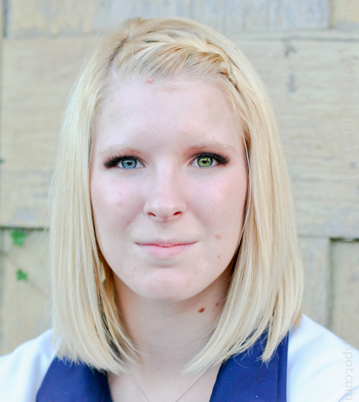
The image to the right is the original image that has been pushed to a near high key state. But when you look closely at the photograph (click on the photograph) you can see that the model has pores in her skin and some blemishes. To make her feel beautiful, I will smooth her skin out.
Getting a little closer in and we can see the details a little better in the image on the right (click to see the larger version of the close up).


To address this we will apply the skin softening preset to the local adjustment brush and paint over her skin surfaces to clean up the blemishes and pores.


Skin Softening After
In applying the brush I used the following brush attributes:
Brush Size: 6.3 through the cheeks, nose bridge, forehead and chin and a 2.3 for the upper lip and between the eyes as well as between the eyebrows and hair.


Feather: I set the feather of my brush to 52. This allowed a smooth transition between the smoothing being applied and where it wasn’t applied.


Auto Mask: Is set to off.


Density is maxed out.


When applying, do not apply over the eyes, lips, nostrils or eyebrows. Allowing these features to shine through allows the skin to look even softer in contrast to these areas without over softening the skin.


Skin Softened
 Any blemishes not corrected by the softening process can be cloned out afterwards. Like with any local adjustment brush, only apply the brush after all basic global adjustments are made.


Download Here


To install the preset, copy the file in the zip (xxx.lrtemplate) to your Local Adjustment Presets folder on your computer. If you don't know where to find this folder, open Lightroom. Click on the Edit menu and select Preferences. Click on the Presets tab and click the Show Lightroom Presets Folder... button.


Sunday, September 26, 2010

Lightroom Preset: Burnt Caramel

The purpose of the Burnt Caramel preset is to create a golden brown/dark cream tone to the image. This is done by using split toning and strengthening the black levels.

The image to the left is primarily blue and in my original processing of the photo, I converted it to black and white, which works all on its own.


I love the look and feel of the photo on the right, which has the Burnt Caramel preset applied to it.

The preset gives the photo a sepia feel without the aged (old) look to the image. It also warms the image a little without having the golden tone of yellow which would look artificial since the shadows in the photo indicate the sun it still high in the sky and that golden hour is a long ways off.

Download Here


To install the preset, copy the file in the zip (xxx.lrtemplate) to your Develop Presets folder on your computer. If you don't know where to find this folder, open Lightroom. Click on Edit menu and select Preferences. Click on the Presets tab and click the Show Lightroom Presets Folder... button.

Tuesday, September 21, 2010

Lightroom Preset: Green Bleach Bypass Cross Process

In developing this preset I was looking for something that would add a slight green hue to the shot without using a graduated filter.


It was important that the green was prevalent in the mid-tones and hinted at in the highlights. It wasn’t until after I had the look that I was looking for that I realized that it looked like a cross of a bleach bypass-like look with Cross Processing.

 
This was accomplished using a green and silver split tone on the image. The green was applied to the shadows and the silver was applied to the highlights.

 
Download Here


To install the preset, copy the file in the zip (xxx.lrtemplate) to your Develop Presets folder on your computer. If you don't know where to find this folder, open Lightroom. Click on Edit menu and select Preferences. Click on the Presets tab and click the Show Lightroom Presets Folder... button.

Saturday, September 18, 2010

Lightroom Preset: Civil War


Civil War: Before the Preset
 One of the powerful elements of Lightroom is the power of the presets. It isn't that presets are particularly interesting or useful in every work flow, but they can save a ton of time for certain types or groups of images.

To the left is the an image taken at a civil war reenactment. By itself, without any processing it is a nice image of a soldier clearing the breach of a cannon that has been fired.

But the photo fails to look authentic to the period. It has strong colors, looks new and fresh: this alone fails to inspire and tell a story I wanted told. Instead it looks like a current day reenactment and that is not what I wanted at all.

Civil War: After the Preset
When I got home from this shoot I knew the look I wanted for the 1200 or so images that I shot at the reenactment. So rather than hand process all 1200 of the images, I used a preset that I developed from a previous reenactment shoot and applied the preset to all 1200 images automatically while I added them to my catalog.

And while I went back into each image to fine tune it, the act of applying the preset to all of the images saved me hours of work applying the settings by hand; adjusting blacks, exposure, sharpening, saturation, and dozens more.

This preset strenthens the shadows, blows out the hightlights a little, desaturates the red, yellows and greens and adds a little punch to the smoke.

For those of you who like the looks of this preset and would like to use it please feel free to download it using the link below. Once a week I will publish a new preset for you to be able to use.

Enjoy.

Download Here

To install copy the file in the zip to your Develop Presets folder on your computer. If you don't know where to find this folder, open Lightroom. Click on Edit menu and select Preferences. Click on the Presets tab and click the Show Lightroom Presets Folder... button.